
You’ve made an application and now you want to style it. How do we get those amazing web-based designs into our Canvas Apps? Well you can use CSS in Canvas Apps by using the HTMLText and manipulating the CSS to suite your needs. This blog post is to show you how to add shadows to buttons in Canvas Apps.
Button
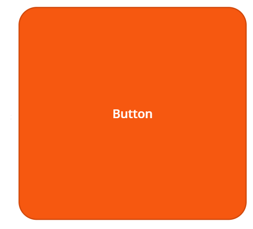
Firstly we want to add a button that we will be adding the CSS shadow to. You want to create this first as we will need the Height and Width of this to create our shadow. So let’s add a button and customize the size.
HTML Text
Now we have our button we want to add an HTML Text item. This is found under the ‘Text’ drop-down on the ribbon bar. The main feature of the HTML Text item is that it allows HTML Tags to be converted to a format in Power Apps. You can read more about this here.
Why is this a good thing for us? Well that means that we can use CSS to create awesome styling and modify it to fill our needs. So, we want to create a shadow around our button. To do this we need to add some HTML & CSS to the HTML Text. You can see an example of this below:
"<div style='background-color: rgba(0,0,0,0); box-shadow: 1px 2px 22px 0px rgba(89,87,87,0.85); margin: 20px; width: 375px; height: 350px; border-radius: 30px'></div>"
So, if you’re unfamiliar with HTML or CSS this may look a bit daunting. It really isn’t! Let’s break this down to understand it further.
Firstly, you need to have the Quotation Marks around the entire code. So lets start with that.
" "
Now we want to create a ‘div’, the ‘div’ element is regularly used as a holder/container for other HTML elements to style them with CSS. Simply put, adding the <div></div> tags opens sand closes a html container element. The backlash on the last div signifies that it is closing that element. So let’s add that!
"<div></div>"
At this point we have told PowerApps via the HTML Text that we’re creating a HTML element. Now we want to add some styling, this is the part that looks scary, but that’s just because there is a lot of text but just think of them as functions. If you do not know what functions are check this blog post out here.
We want to firstly we want to add ‘style=’ so that the div knows we’re going to add some styles (Shown below). We will then put all of out styles within the ” section.
"<div style=''></div>"
Then we want to add a style to make sure that the background is transparent as we only want the shadow outline to display. To do this we use background-color: rgba(0,0,0,0) this tells the style that we want to set the background-color to the rgba value of (0,0,0,0). If you want to use a website to generate rgba colors then you can use this website here. An import thing to note is that we should close off each styling with a semicolon, this lets the style know we have finished with that particular section of the style.
"<div style='background-color: rgba(0,0,0,0);'></div>"
Now we want to move onto the shadow styling. If you’re unfamiliar with CSS then you can use a website by clicking here to generate a shadow type. You do not want to copy over -webkit-box-shadow or the -moz-box-shadow sections just the line with ‘box-shadow:‘. Once you have generated your shadow lets copy and paste that after our background-color semicolon.
"<div style='background-color: rgba(0,0,0,0); box-shadow: 1px 2px 22px 0px rgba(89,87,87,0.85);'></div>"
We now have our shadow added to the styling but we need to add the width and height to match our button so that the shadow starts at the edge of our button but we also need to add a margin. The margin is used to provide space between the edge of the box and the shadow. Why do we need this? Well we need the space as the shadow fades outward and if we do not have a margin (replicates the blur radius size) then we will end up with some of our shadow being cut off. So lets add the button width and height as well as a margin (I use 30px in this example as my blur radius was 22 and I wanted some extra space).
"<div style='background-color: rgba(0,0,0,0); box-shadow: 1px 2px 22px 0px rgba(89,87,87,0.85); margin: 20px; width: 375px; height: 350px;'></div>"
If you’re using a border radius on your button like I am (rounded edges) then you will also need to add the same border radius to the styling of your shadow. We use ‘border-radius: 30px’ to add this.
"<div style='background-color: rgba(0,0,0,0); box-shadow: 1px 2px 22px 0px rgba(89,87,87,0.85); margin: 20px; width: 375px; height: 350px; border-radius: 30px'></div>"
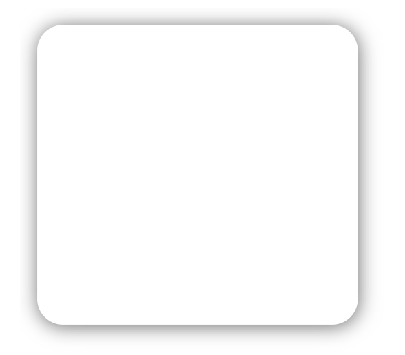
We now have our shadow for our button! (See below)
Alignment
Now all we have to do is align the shadow with the button. We also want the button to be in front of the shadow to make sure you move your button to the front if needed. The easiest way to do this is stretch the HTML Text box to be slightly larger and then try to align this up as much as possible by dragging and dropping. You then was to use the position parameters to adjust the pixels to get a perfect fit. The end outcome should be similar to that which is shown below:
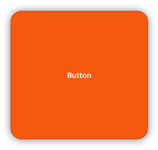
Finished!
You now have implemented HTML and CSS into your Canvas Apps to make your Application look even better! Congratulations!